Sparklines in Excel

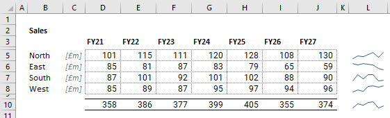
Sparklines in Excel are great little visual representations of your data. They make it easier for users to gain insight into a whole block of numbers without creating large visualisations. They can show key trends in a single cell. The best thing about them is that they are extremely quick to add to your workbook.
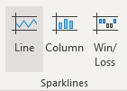
How do you create Sparklines in Excel?
If your select the data you want to visualise, it is as simple as hitting the Insert tab on the Excel ribbon and then choosing an option within the Sparklines group. In our example, we’ve gone for the Line option, but you can also choose columns or win/loss options.
You then need to tell Excel where you want the sparklines displayed by entering a range address or selecting it with your cursor.
Sparklines are useful within your workings, but are also commonly used to bring dashboards to life, making sure that visualisations don’t take up more space than they need to.
At PPS we recognise the importance of visual presentation of the most important information needed for decision making. Effective visuals help communicate insights from data. Learn how our financial modelling services integrate clear presentation techniques into analytical models.